 Before you scoff, YES. Migration data CAN be fun.
The Census Bureau has been rolling out some interesting data visualization tools lately and one of the more recent releases involves Story Maps that look at population change around the country. Using the zoom tool, we can see exactly what is going on in South Dakota and if we want more specifics on the population growth occurring, we simply click on a geography and a bubble will pop-up with the details.
Metro and Micro Area Population Change
 The first story map focuses on Metro and Micro area Population Change from 2002-2003 and compares it to 2012-2013 population change data.
We can easily view population changes between the two time periods by dragging the bar in the middle of the map to the left or right. The left map shows data for 2002-2003 and the right map shows data for 2012-2013. Purple indicates population losses and green indicates population gains; the darker the color the higher the increase.
County Population Growth & Components
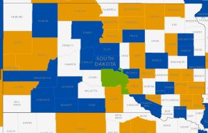
 The second story map focuses on County Population Growth from 2012-2013 along with the primary sources of population change (natural increase vs net migration). This map makes my inner nerd perk up (I don’t get out much). Not only do we get to see, at a glance, where population grew the most, we can also, with a click and drag of the mouse, see why the population changed.
 So if we look at at the components of population change:
- Blue= Natural Increase (births minus deaths)
- Orange = Net Migration (domestic plus international)
- Green = Equal Growth (between the two components)
- White = No Growth (or, in rare cases, no data)
At a glance, I can see that the northern part of the state is experiencing an influx of new residents and it immediately makes me think of the shale oil boom in North Dakota and how their population explosion is trickling into South Dakota. And of course, there’s Meade county, the 8th fastest growing county in the nation, and the rest of the Black Hills region, also impacted by the shale oil boom in the north and west.
The static images I’ve clipped into this post don’t do the story map tool justice, so be sure to pop out to the census website and play around with these maps.
Questions? Observations?
Categories: Data Tools, Demographics

You must be logged in to post a comment.